The last non-work-related project in which I partook was the building of a Mac to be used as my media server. As much as I would have loved to drop some money on a new MacPro, I am afraid that it would be impractical due to the limitation in hard disk locations as well as the exorbitant cost. Ergo, I made a “MacFaux”
The fake mac is pretty simple these days. Sites like OS X 86 Project & Empire EFI give you information you need on what type of hardware to buy, and software to install. Below is the list of items I acquired for this project.
The Case
I wanted this computer to match my normal computer, a MacPro. I looked around on eBay, and couldn’t find anything too well priced in the broken/stripped MacPros. I did however find an ample supply of reasonably priced Power Macintosh G5s. I thought that this would provide a good counterpart to the MacPro, and as an added bonus, had more room on the interior due to the lack of a second optical drive. The tricky part was getting the new motherboard to mount in the G5 case. I accomplished this by taking a piece of sheet metal and drilled holes that match the case as well as the motherboard.
| Part | Model | Price |
| Case | Power Mac G5 | $100.00 |
| Sub Total: | $100.00 |
The Internals
Using the OS X 86 Project as a resource, I got some mac-compatible hardware. It seems that the Gigabyte motherboards are some of the more compatible motherboards out there. Also, I used a PATA DVD drive first since I had it as a spare, however I found that there were less issues using a new SATA DVD Burner I purchased mid-way through the project.
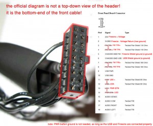
Using this diagram, I enabled the power button, as well as the USB port on the front of the machine by soldering the default harness to some generic PC connectors that go to the motherboard.
| Part | Model | Price |
| Motherboard | Gigabyte EP45T USB3P | $139.99 |
| Processor | Intel BX80571E5300 (Dual Core 2.6 Ghz) | $66.99 |
| Video Card | NVidia 9500 GT | $69.99 |
| Ram | Crucial 2GB DDR2 400 MHz | $50.99 |
| HDD | Western Digital 500GB | Freebie |
| DVD Burner | Samsung SATA DVD Burner 22x | 19.99 |
| Fans | 2x 6″ | Freebie |
| Power Supply | Cooler Master RS750-ACAAE3-US | 79.99 |
| Sub Total: | $426.94 |
EFI-X
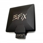
After getting the computer together, and trying to get a stable install of 10.5 (Leopard), I finally resorted to buying the EFI-X module. All it is is a USB dongle with the appropriate drivers required for booting OS X. It is a little expensive, but after weeks of mucking around with the competition, I felt it was worth the cost.
| Part | Model | Price |
| EFI-X Module | EFI-X v1.01 | 99.99 |
| Sub Total: | $99.99 |
RAID
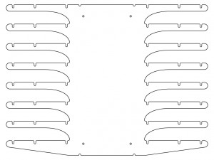
I wanted a RAID 5 setup for this server, and unfortunately Mac OS does not provide a native software solution, so I got a RAID card from High Point. To mount the hard disks, I needed some sort of HDD rack. Not being able to find one that was suitable, I designed one that can hold 8 HDDs and cut it out on a waterjet. After a couple of bends with a sheet metal break, it was ready to go! I got just 4 drives to start off with, but will expand to either 8 drives, 2TB drives, or both depending on my need as time goes on. Unfortunately, since this project began, hard drive prices have gone down considerably!
| Part | Model | Price |
| RAID Card | Rocket RAID 2313 | 140.99 |
| Hard Drive Rack | – | $15.30 for the metal $10 for cutting out |
| Hard Drives | WD 1TB | $72.00 (x4) |
| SATA/Power Extenders | – | $3.00 (x4) |
| Sub Total: | $466.29 |
The Final Result
Once all was said and done, I got my server all up and running. It may not be as elegant on the inside as a brand new MacPro, however the final cost of a thousand dollars isn’t too shabby (Considering that a new MacPro is $2000 or more dollars!) Having used the final product for a few months now, I am very pleased with the results. It has been stable and fast. Live updating has been working great as well!
| Part | Model | Price |
| Case | Power Mac G5 | $100.00 |
| Internals | MotherBoard, CPU, Etc. | $426.94 |
| RAID | Intel BX80571E5300 | $466.29 |
| EFI-X | EFIX v1.01 | $99.99 |
| Total (with tax): | $1043.22 |
Plus, if you aren’t interested in the RAID setup, you can make the the MacFaux for a mere $630!


