 For the better part of my life, I could probably have been classified as an Apple “fanboy.” As a case in point, over the past few years worth of posts, a fair share of them have revolved around Apple products.
There are many reasons I have gravitated towards the Apple brand. Unsurprisingly, my first exposure to the world of computing was with my dad’s old Performa in the 80’s. Since they were my first impression of what modern computing is, I have continued to feel comfortable with, and use Apple computers. Even beyond that sentiment was the mentality of the company that resonated with me. The layout and work flow of Apple’s OS and applications just seemed so intuitive and a joy to use. Apple also had this wonderful campaign that told us that it was okay to think different, and not just blend in with the crowd.
Here’s to the crazy ones. The misfits. The rebels. The troublemakers. The round pegs in the square holes. The ones who see things differently. They’re not fond of rules. And they have no respect for the status quo. You can quote them, disagree with them, glorify or vilify them. About the only thing you can’t do is ignore them. Because they change things. They push the human race forward. And while some may see them as the crazy ones, we see genius. Because the people who are crazy enough to think they can change the world, are the ones who do.
This sentiment of rising above the status quo is something I believe we all want to achieve. That advertising campaign resonated with me, and effectively made me feel good about my choice of not using the mainstream computers of the day.
There is another quote from the early day of Apple that I also felt really explained what the computer’s role should be in our lives. The quote comes from Steve Jobs.
I remember reading an article when I was about twelve years old. I think it might have been Scientific American, where they measured the efficiency of locomotion for all these species on planet earth. How many kilocalories did they expend to get from point A to point B? And the condor won, came in at the top of the list, surpassed everything else. And humans came in about a third of the way down the list, which was not such a great showing for the crown of creation. But somebody there had the imagination to test the efficiency of a human riding a bicycle. A human riding a bicycle blew away the condor all the way off the top of the list. And it made a really big impression on me that we humans are tool builders. And that we can fashion tools that amplify these inherent abilities that we have to spectacular magnitudes. And so for me, a computer has always been a bicycle of the mind. Something that takes us far beyond our inherent abilities. And I think we’re just at the early stages of this tool.
Steve Jobs, 1990
Although quotes and advertising campaigns don’t necessarily represent a company accurately, they did create the mindset of how I perceived Apple, and how I perceived my use of computers from a very early age; that computing should be a quest for efficiency to advance the intelligence and scientific pursuits of the human kind. To not be followers, but leaders, and to have independent ideas.
Apple has always been a company I defended, loved, and depended upon. Unfortunately, Apple is no longer the same company that I grew up admiring. There has been a fundamental shift in the goals of Apple, as well as a shift in the target demographic to which Apple essays to appeal. No longer a computing company, but a device company, Apple has effectively turned their backs on many of it’s previously core-users who kept the company afloat during the hard times.
The Golden Age of Apple Computer
 Nearly two decades ago, Apple Computer was on the brink of death, according to… everyone. Every day, people would belittle Apple, predict their demise, etc. When Michael Dell (founder of Dell) asked what he would do with Apple if he were in Jobs’ shoes, Dell replied, “What would I do? I’d shut it down and give the money back to the shareholders.” Clearly, there was little confidence that Apple could make a recovery.
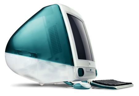
In 1997, after the return of Steve Jobs, Apple made a dramatic turn around. Steve Jobs had a knack for making computers more accessible, and less intimidating. The iMac quite literally saved Apple. Then began the golden years for Apple Computers. Each Mac World was an exciting event with fast-paced changes and innovation. OS X, G3 Towers, iBooks, Titanium Laptops. It was a wonderfully fun time to be an Apple fanatic. Finally, in 2001, the iPod was unveiled, and Apple’s course would really be changed from computer company to device company.
Fast-forward 6 years to the release of the iPhone in 2007. The iPhone was an unprecedented success. It was an innovative market disruptor (I believe those are the correct buzz-words to use here). It was probably the best thing that could have happened to Apple as a company. It naturally led to the iPad; the pinnacle of Steve Jobs’ career. His vision of a consumer electronics device that brought the power of computing literally to the fingertips of the masses. There is no doubt that the iPad is also a success. It truly felt like a magical device.
This move from computing to devices was poignantly illustrated by the simultaneous name change from Apple Computer Inc. to Apple Inc. during the original iPhone announcement in 2007.
Since then, Apple has become a device company, not a computing company.
Device Versus Computer
For me, the difference between a device and a computer is from which direction the information flows. The iPad excels at content delivery; video, social, viral, news, music, etc. It’s all so easy to navigate, experience, and enjoy from the comfort of, well, anywhere! Content creation though is more limited. Though not impossible, there are certainly far fewer tasks that can be done from an iPad than from a full desktop environment.
Computers can solve problems in the sciences (math, medicine, physics), and people can create content with so much more ease than ever before (video production, graphic arts, writing, sharing ideas). The computer was designed to make scientific and creative endeavors easier.
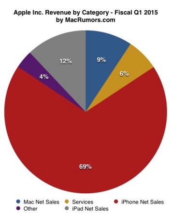
Apple has made it clear that they have changed their focus. That is, that they have abandoned computing in favor of mobile and fashion devices. They have found huge financial success in this focal shift, and as a company, I can’t blame them. The iPad and iPhone outsell the Mac computer line by huge factors, and represents the lion’s share of Apple’s profits. From a business perspective, they can’t be faulted. They are doing what their shareholders want; they are successful.
Unfortunately, with this success and focal shift, it also means that many of us feel that we’ve been left behind. The abandonment of the creative professionals who served as evangelists, supported the company for years, have become entrenched in the Apple ecosystem, and now don’t know what to do.
How have we been abandoned? Here are some examples from the last few years.
Applications – Professionals no longer matter
 Apple has been “dumbing down” or in some cases completely removing professional applications. The first that comes to mind is Final Cut Pro. The change to Final Cut X was a bit of a slap in the face. Many features were removed entirely, and the whole application was made to appeal to a more consumer (or prosumer) audience. Luckily, many of the missed features have slowly been added back in, but it’s still not feature matched to what it once was.
Another application is Aperture, which isn’t being reinvented, but completely removed. Apple has even added a way to export to Adobe Lightroom, completely signalling that they don’t care about that market. And let’s face it; if a photographer is going to use Lightroom, it really doesn’t matter whether it’s from a Mac or a Windows machine.
iWork applications have also recently been redone in order to compliment the corresponding applications on the iDevices. Unfortunately the changes removed features and made some of the simpler tasks much more cumbersome. This shows to me that at Apple, the aesthetics if their applications take precedence over actually being useable and powerful.
Design – No longer a leader
Apple has traditionally led the design trends in the computer industry. So much thought is given to every Apple product. Steve Jobs was meticulous this way, and very demanding about the look and feel of a product. A computer should not be intimidating, and should be natural to use; intuitive.
Apple started many design trends over the years. Other companies often followed suit when Apple would do something bold. For example the original iMac came out, and it was so different from anything the computer world had seen. At first it was mocked, but quite soon it was emulated. Similarly, when the Titanium and Powerbook G4 came out, other companies started using aluminum and silver colors on their laptops to mimic the clean, elegant look of these Apple notebooks. Another example is the use of clean white polycarbonate plastic, like the iMac G5, iBook G4, and MacBooks. Other manufacturer’s adopted the looks, but these were all design trends that Apple initiated.
In the realm of software, OS X was a huge departure from conventional OSes. It make heavy use of drop shadows, transparency, and color. I was enamoured by the aesthetics. It looked like the future. Eventually, these same design elements made their way to the Web and to other OSes.
Recently, It seems that rather than setting the trends, Apple has begun to follow. The new “flat” design craze was not started by Apple, and their Yosemite/iOS7 responses are completely reactionary, and quite uncharacteristic for Apple.
Flat design really goes against the original design concepts from Apple’s early days. Steve started a trend of using “skeuomorphic” design elements, or using digital analogies for every day tasks and items that people would understand, in order to make the computer less intimidating, and more intuitive. This hit it’s peak in iOS6 and Mac OS X Lion. All of a sudden, these skeuomorphic elements were erased when Scott Forstall was ousted from Apple. The new OSes have completely been redone in order to look modern by mimicking the competing OSes like Android and Windows 8.
I find that flat elements are so harder to decipher. Take a button, for example. In iOS 6, you knew a button was a button because it had an outline, and looked raised, much as you might expect a button in real life to look. Conversely, in these new flat OSes, A button might be represented by a piece of text. There is less visual differentiation of how an object behaves, which make an application harder to use intuitively. Sure, it’s useable once you know what is or isn’t a clickable element, but good interfaces shouldn’t have to be learned. They should be intuited.
Additionally, the flashy colors and transparency reduce contrast on lettering and make it more difficult to read. The thinning of font compounds this problem for some people. Apple has chosen to abandon their quest for ease of use and intuitive design in order to follow the flashy trends set by Microsoft and Google. Clearly this shows they are more interested in being a fashionable than innovative.
Hardware – Turning the back on it’s core-customer

Apple has had a theme of trying to make hardware as user-friendly as possible. This extends as far back as the original Macintosh. Steve Jobs wanted the computer to just work, and to not be tampered with. Oddly, things loosened up over time, and even after Steve’s return, some of the most upgradable Macintoshes came into existence. For example, the Power Mac G3 ushered in a design that was specifically meant to allow user access to the innards and to freely add RAM, swap CPUs, replace hard drives, etc. This trend continued until quite recently.
Although the Mac Pro has done away with this to some extent, it is still provides the user with the ability to upgrade RAM and to extend the computer’s features via Thunderbolt. Still not quite like providing PCIe slots and hard drive bays, but it’s a workable solution for many people.
The most recent affront to the professional user and tinkerer is the Mac Mini. The Mac Mini has been the chosen device for many hobbyists out there due to its small price tag, upgradability, and performance. It even had the tagline, “Add memory with a twist,” for a time, referencing the bottom cover that easily twisted off to reveal user-upgradable parts. The new Mac Mini is anything but user-upgradeable. It has a metal grating with security screws where the easy access used to be. The RAM is now soldered to the motherboard, meaning that you have to anticipate in advance how much RAM you will need rather than being able to upgrade the machine over time as your needs dictate, or budget allows. And foremost, Apple has removed the build-to-order option of a quad core i7 processor.
Other machines are also seeing the user upgradability go away. The lowest-end iMac has soldered ram. No machines have socketed processors any more. This, in my opinion, decreases the life of the computers, and forces users to buy new computer more often than they would have to otherwise. Not having serviceable parts like RAM, processors, or even hard drives, makes the computers disposable. One part of the computer fails, and you have to just buy another. In short, this change shows a paradigm shift from computer company to consumables company.
Apple Watch – Finally a fashion icon
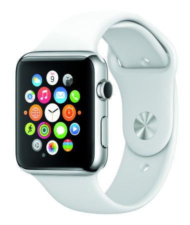
 Really? A computer company is selling a watch? A big watch? With a single-day’s worth of battery life? And they are placing the watch in fashion magazines? People really need another way to get status updates from their phones? This is just too much for me. I love my analog watch. I change the battery every couple of years. It never beeps at me or tried to grab my attention. It just sits there, always ready for me to look at it and find out what time it is.
The Bottom Line
Apple is now a fashion and device company. They no longer care about their professional users. They don’t care about their computing line anywhere near as much as they do their mobile and fashion lines.
And who can blame them?

Apple makes more money on their mobile devices in a month than they make on their computers in a year. They are making the right decisions from a business perspective. They are driving their profits up, and driving their stock prices up. There is absolutely no reason they should change what they are doing. The few people, like me, who feel disenchanted, or even betrayed, really don’t matter because there are 10 times as many teenagers who are going to buy a watch this year. We really don’t matter.
The bottom line is that the bottom line is all that matters.


