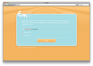
I recently rebranded echa.me, a file-sharing service. The rebranding included both web design and logo. The site is simple and rather minimalistic, which corresponds with the site’s ultimate goal of being a simple, unobtrusive file-sharing service. The site was designed in Adobe Illustrator, and the HTML was edited in emacs. Their new site should be up soon now!
Category: Design
Graduation Announcement
My sister-in-law graduated from high-school, and rather than buy pre-made announcements, she had her relative-graphic designer help her out (me). My photographer friend, Amanda, took the photos, which I then put into this announcement. The silhouette in the background is a cut out of one of the pictures.
Logo Refresh
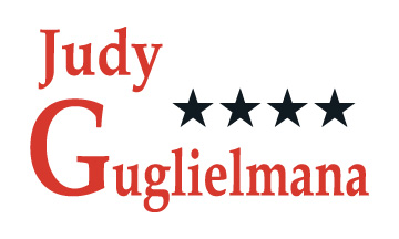
I recently refreshed a campaign logo for Judy Guglielmana, a local elected official. I wanted to keep the basic idea she has used with past elections, and clean it up a little to make it more contemporary. Below is the original artwork.
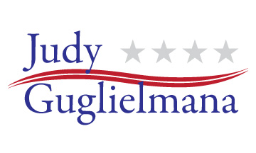
The following is the revised logo. The stars remained present, but more subdued in grey. I also added the wave in red. The font is now a uniform size, making it look more “classy,” and is also no longer disproportioned horizontally. I am very pleased with how the new logo turned out. It looks good in color as well as in white knockout on dark colors.


