LCARS Clock

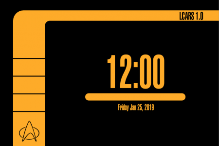
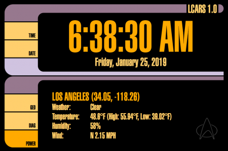
LCARS, the Library Computer Access and Retrieval System, is the fictional operating system used in the 24th century on Star Trek the Next Generation, Voyager, and Deep Space Nine. LCARS was designed to be a futuristic looking computer interface, while being very cheap and easy to create for the sets. In the show’s production, the effect was made by taking plexiglass sheets, applying vinyl shapes to the glass, then back-lighting it. It was a great effect and really sold the futurism that was felt when looking into the world of the Enterprise D. The entire design of the Enterprise D is very special to me, and seeing it gives me that nostalgic sense of coming home.

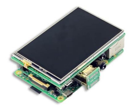
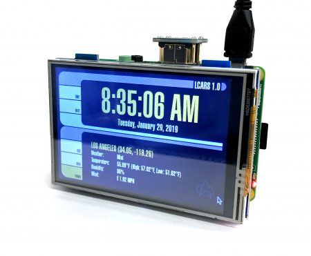
I recently found a small 3 inch display for the Raspberry Pi. It was only about 20 dollars, and I thought that was really nifty, and bought it without really having an idea what to do with it. After I got it, It seemed so neat that I thought it would be so cool to display something on it with an LCARS style interface. I like clocks, so why not start there?

After looking for something ready-made and not finding anything I really liked, I decided to make my own. On my list of things to do was to try using SVGs to make a website. This seemed like a perfect opportunity to do just that.

SVG (Scalable Vector Graphics) is a format that describes graphics by lines, curves, and points. I’ve used SVG a lot in design projects but not much in online applications. I started out by creating a basic design on Affinity Designer to the scale of my little screen.

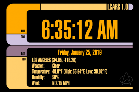
Once the design was prototyped, I saved the file as an SVG and created an HTML wrapper around it, and began getting it set up. I started writing the Javascript that would actually display the time. That was pretty easy as it turns out. I was so pleased by the results, I decided to expand upon it, and add weather to the display.

To add weather, I had to do a few things. The first was get the location of the user. I wanted to avoid having to input anything and wanted the geolocation to be automatic. This is pretty easy using the built in command on most browsers.

navigator.geolocation.getCurrentPosition()

This will pop up one of those confirmation dialogs that the website wants to use the user’s current location. In the event that the user selects no, I wanted a fall-back solution as well. This is done using a free service from geoiplookup.io. They have an API that requires no key that returns JSON data.

Between the two of those options, I now have the approximate latitude and longitude of the user, and can query a weather website about the weather. I am using open weather map for that. They require registration to use the API, but it is free and caps out at 10,000 queries a month. That’s about 13 times an hour. For now I decided that 1 update an hour would be enough.

Their API returns JSON data that is easily parsed to get the weather and other things. Things are looking good.

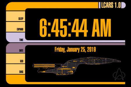
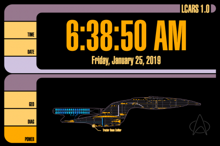
Now I decide that I have these elements just sitting there, surely I could do something more interesting with them. What’s really cool about SVG is that the elements are just like HTML elements, and that makes it really easy to use with Javascript. I decided to make buttons on the side to do more than just label things. Clicking the time button cycles format (blinking separators, 24 hour, etc) and clicking the date button cycles date formats (US, ISO, Star Date, etc). Lastly, I decide to add a diagram of the Enterprise that replaces the weather data when “Diag” is pressed. I happened to have a vector drawing of the Enterprise that I made a few years ago that I could repurpose.

It looked spectacular. I was very happy. But like all projects, it’s fun to keep fiddling. The next step was to make the diagram less static. This time, instead of using Javascript to affect the image, I decided I would try SVG animations. These were completely new to me.

I wanted the nacelles to have the the flowing blue texture that we often saw in the TV show. I made a mask, and a gradient map in Affinity Design and then created an SVG animation where the gradient would pass behind the mask and move 30 pixels, then reset and repeat. It looked so great!

  <rect x="1" y="20" width="150" height="46" style="fill:url(#_Linear2);">
<animateMotion
path="M35,0 5,0"
begin="0s" dur="1s" repeatCount="indefinite"
/>
</rect>

Next, I decided to add points of interest to the diagram. I created all the points by hand and then used SVG animations to make them appear and disappear sequentially. This is done by having the animations kick off when they see the previous animation being completed. Once I overcame a few pitfalls, it came together great and was really easy.

Lastly, I wanted to move the diagram out of the main HTML. The SVG data was really cumbersome, and I wanted to have it be isolated for clarity. This was done by moving it to it’s own document, and giving it the proper SVG tags. In the HTML, I created an image tag that links to the SVG file, and then wrapped it in a g tag with a transform command so I can place it correctly within the main graphic.

    <g id="diag_data" transform="matrix(1,0,0,1,75,180)" style="display:none;">
      <image x="0" y="0" width="380" height="150" xlink:href="diagram.svg" />
    </g>

There is only one minor problem now… I’ve defined a custom font in the main HTML, and the embedded SVG can’t use it. Additionally, defining a custom font in the embedded SVG file does work when looking as the file directly, as soon as it is embedded using and image, img, or object tag, the fon’t definitions break. I believe this is a security thing, but I’m not really sure. The only way I could find to solve this problem was to embed the font as data in the SVG file.

I used a service I found at font-converter.net that gave me the encoded data, and then I put it into the SVG file. It worked like a charm. It’s not super pretty, but it worked.

<style type="text/css">
<![CDATA[
@font-face {
font-family: 'lcars';
src: url(data:application/x-font-woff;charset=utf-8;base64,d09GRgABAAAAAF2IABEAAAAAkoQAAQAvAAAAAAAAAAAAAAAAAAAAAAAAAABGRlRNAAABgAAAABoAAAAcGo5L0kdERUYAAAGcAAAAHwA... continues ad infinitum...) format('woff');
}
]]>
 

The result is about a day’s worth of tinkering, and I’m very pleased with the result. I am also really excited about how easy working with SVGs was with Javscript, and want to find another project that gives me an excuse to tinker some more.

Update

I had some trouble configuring the touch screen on my Pi. It seems like there was some information missing. The first thing is that the brand of touchscreen I purchased was Kuman, specifically the 3.5 inch HDMI screen. They have multiple models; some that use HDMI, others that use GPIOs. The original drivers I found for it were outdated and not meant for the current Raspbian OS. The newest drivers are available here on their GitHub page.

The second mistake I made was trying to install with the incorrect install script. I was using the “LCD35-show” script which is actually intended for the screen that does not use HDMI. That resulted in a black screen and no touch input. The correct installer for my screen is the “MPI3508-show”. After executing the script and rebooting, the screen worked correctly.

Technical Drawings

When I was pretty young, my dad was working at a start-up with relatively few employees; maybe twenty or so. I used to go in and help with odd jobs. It started with assembling workbenches, pulling CAT5 cable and graduated on to mechanical assembly and packaging of products. Along the way I learned other skills too, like soldering, debugging, and illustration.

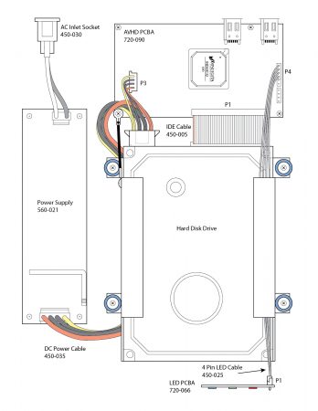
I grew up with exposure to Adobe Photoshop and Illustrator. Because of this exposure, I was asked to create an assembly drawing of our product. I had never done anything that complex before. I was sat down in an office with a computer running Adobe Illustrator, along with the assembly that needed to be drawn. I was pretty familiar with the part since I had assembled hundreds of them before. I worked for a full day (maybe more, I don’t remember since it was so long ago) and I created my first technical drawing.

Assembly Diagram for Indigita AVHD

I found that I enjoyed working in this style. Even today, I’m pretty pleased with how my first foray turned out.

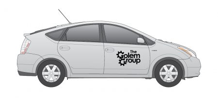
Over the years I’ve had a few occasions to do this type of work, but not as often as I might prefer. When my family was involved with the Darpa Grand Challenge, I made some illustrations of the car, Golem 3.

Side view of a Prius

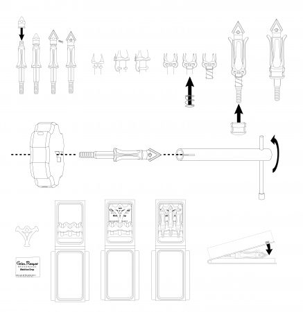
During my education I had numerous times when I was able to make use of this type of drawing for research papers and reports. In my internship, I created assembly instructions for mechanical arrowheads which relied heavily on technical drawings.

Assortment of product diagrams used in assembly instructions

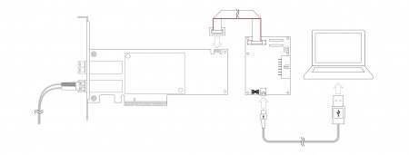
Presently my full-time job description does not include this type of work, but I have found occasions when it became necessary to create drawings. For example, the user manual for the software I am working on needed diagrams to illustrate connection of the hardware with which our software operates. I took it upon myself to provide the artwork. It was a nice break from the routine.

User’s Manual Connection Diagram

In diagrams, it’s important to use visual cues to convey orientation and differentiate parts. It’s equally as important to reduce extraneous features in order remove visual noise and not distract the viewer. Finding that balance of conveying enough, but not too much, visual information is very rewarding.

I also like the freedom of working with fewer colors. In many instances, these types of drawing will be printed in black and white, and even when drawings can be viewed in color, it’s best to leave them less saturated as to not distract and draw the eye of the viewer to unimportant details.

Doing this type of work is very relaxing for me.

20,000 Leagues Under the Sea

20,000 Leagues Under the Sea is one of my favorite movies. I watched it repeatedly as a child. My favorite thing in the movie was the iconic Nautilus. The Nautilus was designed by Harper Goff for Disney’s 1954 film. I love the mixture of organic and mechanical design. Even as a child, I thought the submarine was pure beauty.

I’ve attempted many times to capture it’s likeness in drawing. I’m not much of an artist, but I think you can tell what the subject matter is.

I finally decided to purchase a model. I found a highly detailed model from Masterpiece Models for $100. It’s a 16 inch model based off the reproduction fabricated by Scott Brodeen. In the Nautilus community, his is a well-known name. He researched and created master models that are the most accurate reproductions available, going as far as to place all of the thousands of rivets as accurately as possible.

The kit was pretty good. I had a few issues with it as I went. As is common with models, there was a lot of flashing that had to be removed. This is a solid resin casting, and not hollow, so there is some heft to it. A few of the mold lines didn’t seems to be lined up correctly which made some of the smaller pieces less uniform that I would have liked. Specifically, the upper part of the nose, and the support struts for the rear rotor cover.

On the main body, there were some defects. The front of the nose was actually missing. It looks like when they filled the mold with resin (from the tail) the resin never reached all the way to the nose, or there was a large amount of air trapped there. I got some plastic and turned it down to an acceptable approximation and glued it on to the front. Some of the rivets also had bubble problems.

After doing the clean-up and most of the assembly, I did a light primer coat of black.

The interior of the wheelhouse I did a clean steel color. I deviated from what the instructions suggested for colors, and did my own based on memories of watching the movie. The wheel and wheel column are gold.

The lights I painted a mixture of yellow and gold paint.

The remainder was painted using a Modern Master’s Reactive Iron Paint that contains ferrous particles that oxidize using an activator containing acid. Following the instructions, I brushed on two coats of the paint. It comes out as a flat, almost gun-metal grey. A tad darker perhaps.

The magic happens when you apply the activator. I re-purposed a small spray pump that had contained eye-glass cleaning solution. I sprayed it on fairly generously, and then let it sit for 5 minutes. I then applied heat from a hair dryer. You can see the how quickly this take effect form the time lapse footage.

Once everything was painted, I had to apply the bubble domes to the lights and windows. The domes (4) were created using vaccuform, and unfortunately were a bit too large for the openings on the resin model. I ended up using a heat gun to soften the domes in order to place them. Once placed, I tacked them in with super glue.

The lights also needed clear bubble coverings. The kit came with 2 different sizes of googly-eyes. The eyes needed to have the backing removed. I kept dropping them, and they are incredibly hard to see. They too were pretty close in size, but there were a few that didn’t fit as well as I would have liked. I use super glue to place these. Of the entire model, I am most disappointed with how well I executed these, however they are a small enough detail that I think it looks okay from a normal viewing distance.

I assembled the remaining components; Hull, wheel-house covering, upper nose, and observation window structures.

I now have my own recreation of the Nautilus that I can enjoy.

© 2007-2015 Michael Caldwell