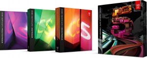
Of all the software I have been excited for in the past years, Adobe Creative Suite 5 has been one the one that I have anticipated the most. Ever since the switch to Intel, I have been hoping for a creative suite that would take advantage of the processing power. Prior to CS5, none of the Creative Suites were written in Cocoa. This created some restrictions. First of all, they were only 32 bit, could only address 4 gigs of ram, and were generally sluggish, but usable.
What I Don’t Like About CS5
CS5’s big claim was that every application had been rewritten in Cocoa instead of Carbon. This would allow them to take full advantage of the computer’s processing power. First of all, not all the applications have been written to support 64-bit processors. Only a few have been, namely Photoshop and Flash. I stand with Apple on the uselessness of Flash, so that means nothing to me, and I rarely use Photoshop. As a designer, I spend 90% of my time in Illustrator, and I feel that I have been severely left out by not having it be 64-bit. When working with complex designs that get themselves to more than 500 megs, it begins to show, and the application slows down even though my processors are not being fully taxed. In fact, the over all feel on CS5 is a bit sluggish, even more so than CS3, and even simple things like panning and zooming seemed snappier in CS3 oddly enough.
The new features presented in CS5 are also less than compelling. Adobe has been really advertising their content-aware fill. I’ve played with it a little bit to see how well it works, and it does an amazing job… for a computer. For any serious work, it creates a good starting point, but still leaves a lot to be done by the designer, and I admit that it can take hours of work off of someone’s work flow if they are in the retouching business. The rarity of me performing such tasks makes this a neat but not necessary feature. I first tested Content-Aware Fills on a panoramic picture that I had taken a while back. I wanted to fill in the edges where the pictures merged. The file was a mere 28,000 x 2750 px image with rough edges that I wanted to try filling instead of cropping off. Once I got everything all ready to go, and tried the feature, it ran for a few minutes before stopping with the error: “Ran out of memory.” I would normally not find this too hard to believe, however my activity monitor showed that I had 13 gigabytes of ram currently free! Well, I ended up doing it in portions. And the results weren’t as great as they made it seem in all the demos. I suppose nothing is ever as good as when the salesman presents it.
As for Illustrator, the features I most look forward to are some which were introduced in CS4 (namely multiple artboards). CS5 offers a new feature called “Perspective Drawing.” It seems like an interesting idea, and I’ll bet this is going to make some designers very happy, but for me, I have never had the desire to draw building perspectives, etc. Its the big new selling feature, and it really does nothing for me.
This may be petty, but the new icons are ugly, and apparently Photoshop thinks it’s too good for the standard beachball cursor, and replaced it with its own inconsistent waiting cursor.
And you know what was the only thing about the entire suite that actually infuriated me? The fact that Adobe installed Growl automatically without asking me. I hate growl. I hate having everything I do pop up on the corner of the screen and obscure my desktop, icons, and work. Yes, it was easily removed, but it still annoyed me that Adobe would assume that I would want it…
What I Like About CS5
Over the past months of using CS5, I have come across some new features as well as non-advertised features that I really come to appreciate.
As I stated before, I really love having multiple art boards as introduced in CS4. This is also accompanied by many other features Introduced in CS4 that I never knew since I am leapfrogging from CS3 such as the improved gradient tool, alpha channel support in gradients, and other assorted goodness.
Though Illustrator is still a 32 bit application, certain rendering processes feel faster even though the interface still suffers from some basic sluggishness.
Photoshop can now handle having more files opened at once. CS4 and prior versions had a limitation of 99 documents being opened at a time. Though it is rare for me to need to have that many files opened at once, it is nice knowing I can do well over 200 in CS5.
Photoshop is noticeably faster in many regards, especially in applying filters. The rewrite into Cocoa shows a considerable improvement.
Overall, this suite has seemed very stable. I have had no crashing errors for the most part which seem to have been abundant in CS4 from my limited time using it at work. CS5 feels solid and I have been very happy with it.
The Bottom Line
I held off buying CS4 because it was still Carbon, not Cocoa. I felt that CS4 was a waste of money for only a few features and little performance improvement. CS5 may not have all of the upgrades I had originally desired, however it does bring many features to the table, and various performance improvements that I find valuable. I have been very happy that I upgraded, and hope that Adobe finishes the job by extending all the benefits of Cocoa to each application in its entirety.
Don’t think that since I have more to say about what I don’t like that it makes CS5 not a good improvement. It’s much easier to criticize the things that bother me rather than give accolades for the things that I take for granted since they just work. Overall, I have been extremely satisfied with CS5; more so than I ever expected going into it!


