A client recently wanted a bag template that they could easily put a design on and instantly have a mock up of their packaging. I accomplished this by using meshes, gradients, different types of blends and of course masking. Here’s how I did it.
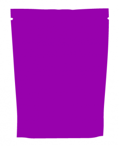
First I created an outline of the basic shape off of a photo I took of an example product. This shape will be used for quite a few things along the way.
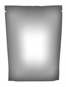
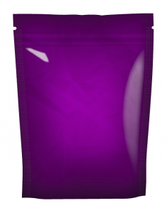
Next I duplicated the shape, and converted it to a gradient mesh object, then used shades of grey to do a basic shading. This layer will then be multiplied onto the artwork to give the 3D look.
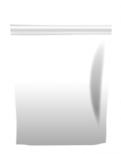
i then used other shapes and gradients to do some accents like the luminosity on the right. I used that first shape I made along with the pathfinder tool and new paths to make the appearance of the seal across the top. The light areas were set to screen, and the dark areas to multiply.
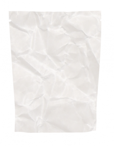
I then used a paper crumple texture I found online, and masked it to the first path and applied this as a multiply as well. This makes it appear less pristine and more realistic.
Finally, I made the edges appear sealed by creating a lot of dots around the edge of the bag with the blend tool, blurring them, then finally setting their blend mode to screen at 15%.
With all the layers combined, it makes the packaging look a bit more realistic, albeit not photorealistic. I had to do this in a budgeted amount of time, and therefore couldn’t afford to get much more realistic.
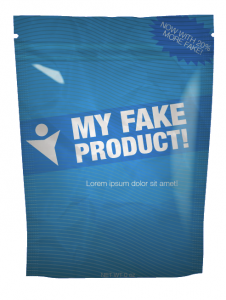
So now, any graphic can be used by masking it to the first path and placing it behind all the blending layers for an instant mockup. Here is a fake sample product design I whipped up in 2 minutes to demonstrate since an NDA prevents me from revealing the product I was really working.
