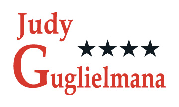
I recently refreshed a campaign logo for Judy Guglielmana, a local elected official. I wanted to keep the basic idea she has used with past elections, and clean it up a little to make it more contemporary. Below is the original artwork.
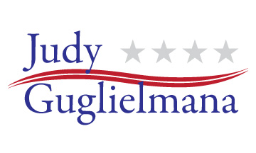
The following is the revised logo. The stars remained present, but more subdued in grey. I also added the wave in red. The font is now a uniform size, making it look more “classy,” and is also no longer disproportioned horizontally. I am very pleased with how the new logo turned out. It looks good in color as well as in white knockout on dark colors.

